Cover Reveal for JOSIE AND VIC
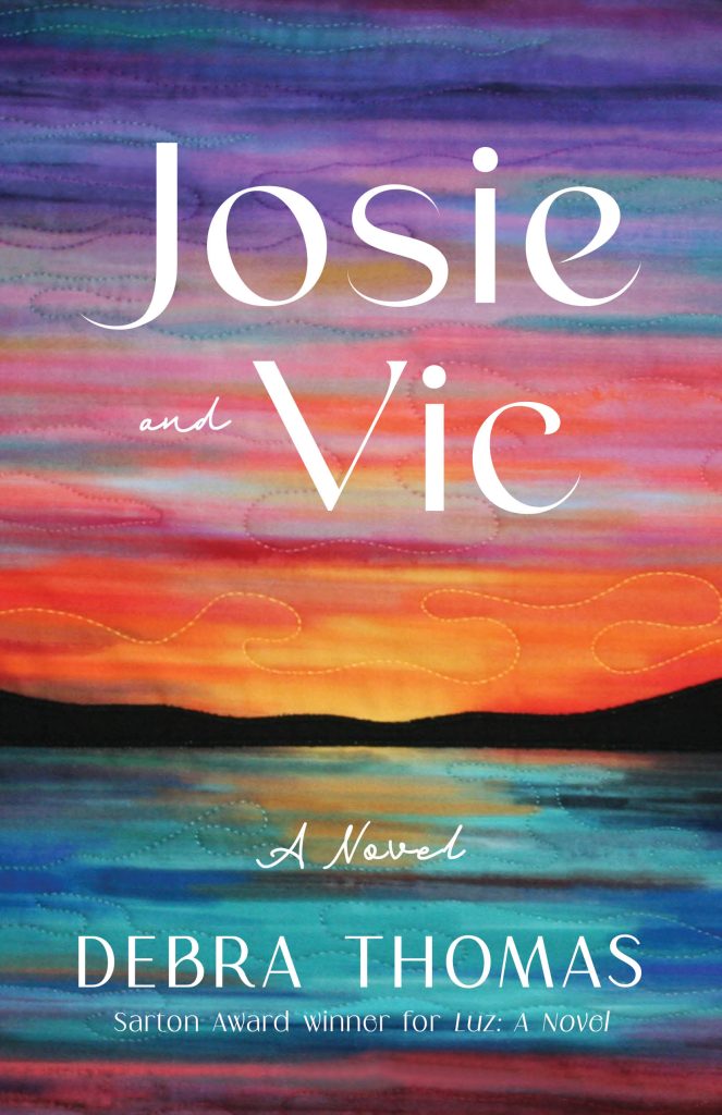
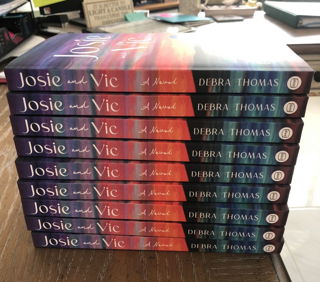
While a cover reveal is best done closer to publication date, I’m already seeing images of my April 2023 novel, Josie and Vic, on Goodreads and social media. This is because I’m receiving some lovely early reviews of my Advance Reader copy. Exciting! So perhaps now is a good time to share my beautiful cover, as well as an essay I wrote about the story behind it.
My Cover Stories
“Sometimes the world hands you exactly what you need when you need it.”
Deciding on a cover design for a book is as stressful as choosing a wedding gown. It’s also just as exciting—when you finally find exactly what you want.
I was fortunate with my first novel, Luz, because I knew I wanted a blue cover with one white calla lily, a candle flame at its center. These are the colors and image on the treasured wooden box that my character, Alma, carries on her journey—a gift from her missing father whom she’s trying to find. In the hands of cover designer Rebecca Lown, a stunning cover was created. I couldn’t have been happier with the results.

But my second novel was a different story. First of all, I was calling it The Promise of Pangaea and picturing images of either the supercontinent Pangaea, with all continents connected, or the fragmented continents pulling apart. My protagonist Josie, as a young girl, is fascinated by Pangaea and sees her own world as coming apart after her father abandons the family and later when her brother leaves for Vietnam. To me Pangaea was symbolic of the once connected, now fractured family in my novel. But for a novel cover?
Sure enough, from an artistic and marketing point of view, neither title nor image appealed to my publishing team. They felt the title would be confusing to readers who were unfamiliar with the meaning and pronunciation of Pangaea, while a cover with a globe design would not exactly be flying off shelves in the fiction section.
We then agreed on the title Josie and Vic, the names of my two main characters, a sister and brother, whose stories are told in alternating chapters. As for a cover idea, I drew a blank. Maybe an oak tree with complex roots, like a family tree? Or some image that reflected light rising out of darkness since Josie helps Vic through an unimaginable tragedy? I struggled to come up with specific ideas and hoped the cover designers would have better luck.
The first cover concepts that they presented to me were lovely depictions of Southern California (the novel’s setting) with palm trees, the ocean, and a winding road. Nice as they were—and perhaps that was my problem, possibly too nice—they just didn’t feel right. Like that beautiful wedding gown you try on and your mom thinks is perfect, but lovely as it is, it’s just not you. Still, I couldn’t come up with any other brilliant ideas myself, so I made the decision to work with the winding road and palm trees concept.
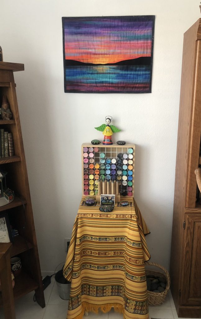
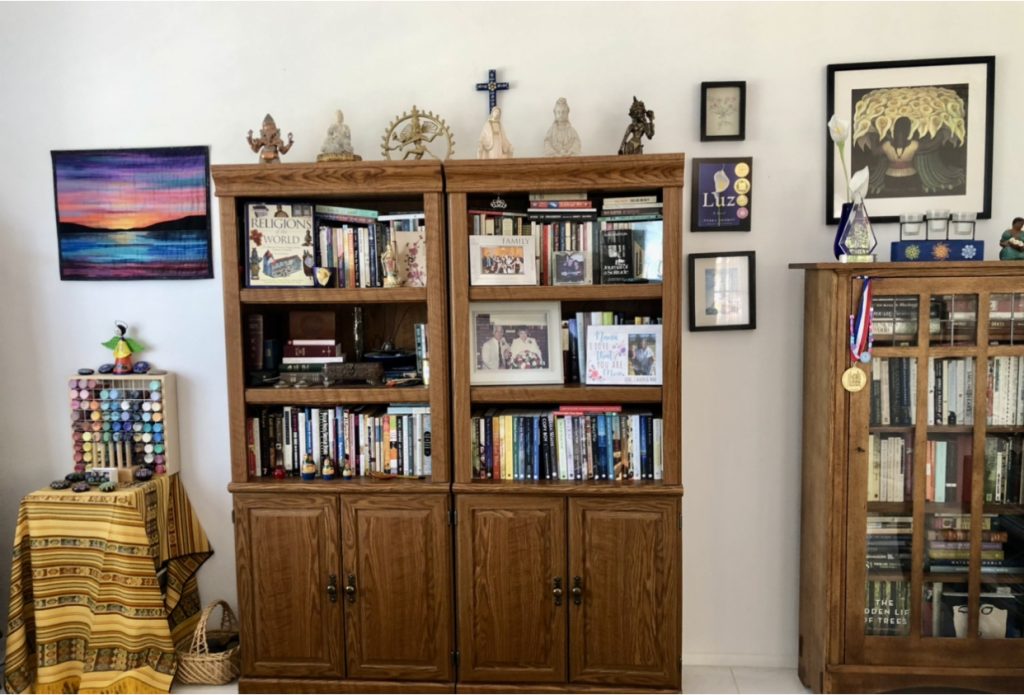
Around this time, a dear friend, Barbara Craig, posted pictures on Facebook of some quilted wall hangings she made. One caught my eye right away. Layers of color with the sun rising out of a strip of darkness. It reminded me of colorful Guatemalan fabrics that I’ve always admired. I loved the design so much, I bought it to hang in my study. It looked perfect above an array of paints that I use for my mandala stones
That same week, on a drive down to visit my grandsons, I started listening to bestselling author Ann Patchett’s audiobook, These Precious Days. Her essays were the perfect entertainment for a four-hour drive, deeply moving and utterly delightful. The fact that I was actually listening to her voice as she narrated the audiobook made it all the more personal and powerful. She spoke about her three fathers, her experiences in Paris, how Snoopy was a huge influence in her writing life. But then Patchett started talking about her own “Cover Stories”—and I was riveted.
In one instance, Patchett described rejecting a cover idea that she later realized would have been the better choice. For The Dutch House, her determined search for the perfect cover led her to commission a portrait painter to create her character on canvas, and to Patchett’s stunned surprise, the dark-haired girl in a red coat looked exactly how she’d always imagined her. Then, near the end of the essay, she described how a friend’s art work had unexpectedly become the cover of These Precious Days. With emphasis, Patchett spoke the following words—and I felt like she was speaking directly to me. “Sometimes the world hands you exactly what you need when you need it.”
Immediately, I saw the wall hanging with its vibrant colors and the light rising from the darkness. It was like slipping on that final wedding gown. The one that’s perfect—that one that makes you feel like you. This felt like Josie and Vic.
The next day, I emailed my publisher about the possibility of using this on my cover and asked if we could pause the cover process while I researched who owned the rights to the fabric design. I had no idea where to begin or if this would work at all, but Patchett’s words kept me moving forward. “Sometimes the world hands you exactly what you need when you need it.”
With Barbara Craig’s help, I traced the design to Hoffman California Fabrics. I contacted the company by email and phone and was eventually connected with the Vice-President of the Manufacturing Division, Tammy Melott, a warm and friendly woman, who listened with great interest to my ardent request. By the end of our conversation, she said she’d speak with the owners of this family-owned business, and she was confident we could work something out.
Within a few days, we reached a very reasonable agreement that allowed my publisher the use of Hoffman’s lovely fabric design on the book cover of Josie and Vic. This agreement included Hoffman’s request for a few copies of the final book—to exhibit in their display rooms!
Everything was moving along smoothly. Perhaps, it was meant to be.
But my excitement was soon dashed when I was informed by my publisher that my iPhone photo of the wall hanging was not adequate for cover purposes. If I really wanted to pursue this, I had to find a professional photographer to shoot the wall hanging at the specific settings of 300 dpi, height of 9 inches. A professional photographer?
And so my search began for a photographer who could quickly and inexpensively help me out.
After a number of unsuccessful phone calls ($150.00 quotes!), I found a digital photo lab that offered this service at a more reasonable price of $25.00. I dashed over with the wall hanging, and the photographer took the photo. But when his assistant opened it on the computer, numerous wrinkles appeared on the screen. My heart sank.
Then his assistant spoke up. “I’m a quilter,” she said. “No problem at all. Let me stretch it gently on a frame, shoot the photo, and you’ll be all set.” She was a quilter!
“Sometimes the world hands you exactly what you need when you need it.”
In the end, all the pieces came together—like a quilt, like the supercontinent Pangaea, and just like the fragmented family in my novel, Josie and Vic. For me, it’s a perfect fit.




Fabulous Deb! Everything comes together as it should be and happens for a reason,! Can’t wait to read this one! Congratulations
Thanks so much, Deb! Certainly feels like it was all meant to be.